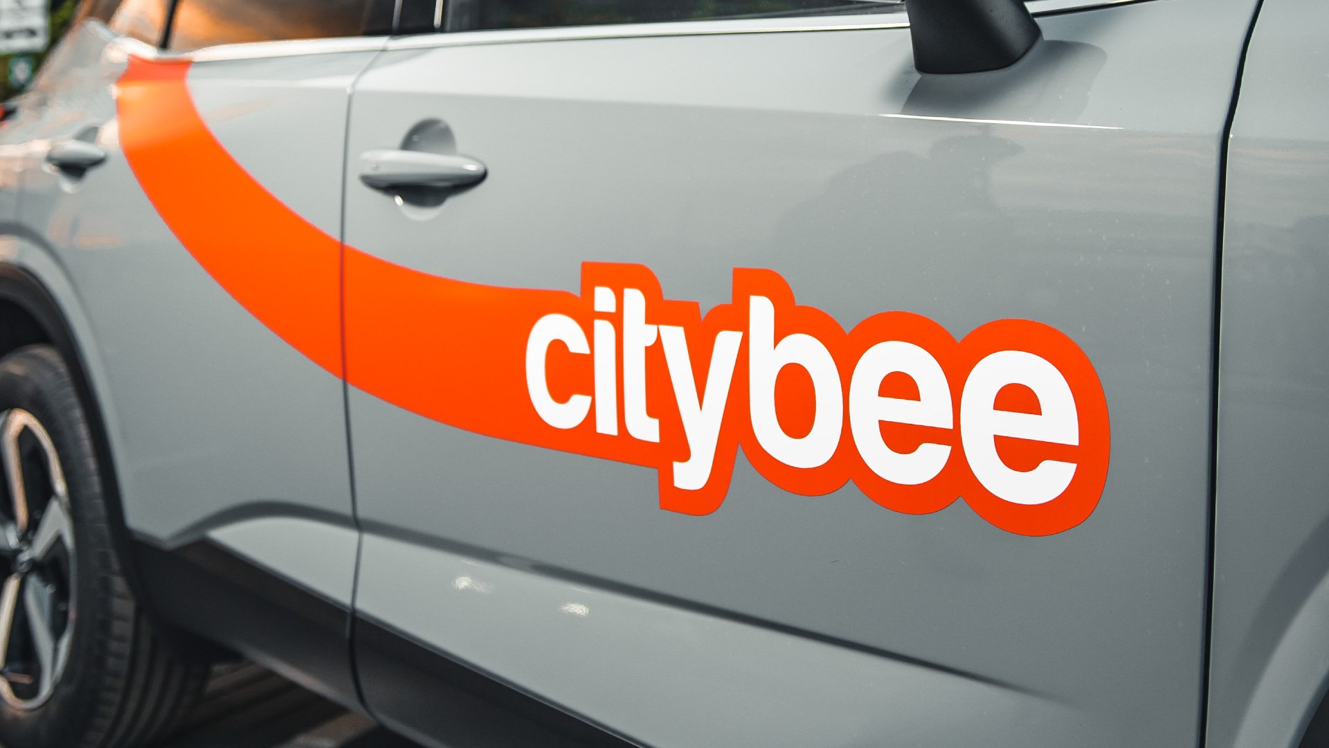
CityBee car livery design
I'm thrilled to unveil the fresh look of our car wraps, alongside my colleague Ieva Maciune You're probably wondering why we've taken such a bold leap away from the long-standing dotted line design.
We recently launched a new brand awareness campaign, and we want to emphasize our bright orange identity by reflecting it on the cars themselves. The new design offers greater visibility, and a bolder presence of the orange color. This is part of our visual identity update, which moves us away from the dotted line.
Why the rounded line? We want to be not only noticeable but also look dynamic, attractive, and modern. The line starting at the roof and ending at the logo represents our speed and commitment to saving you time. It signifies a service that gets you where you need to be without worry or hassle.
Another key consideration is visibility. We want the cars to be noticed not only up close but also from a distance and from all sides. That's why we've added a sticker to the hood, making them easier to spot even in tight parking spaces.
Choose orange. Choose CityBee. 🧡


